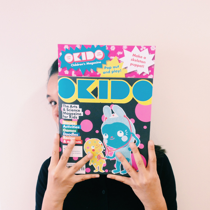
I’m over the moon to have illustrated for OKIDO the crazy, clever and coolest art and science magazine for kids. So I thought I'd share with you the creative process behind the spread I created for Issue #31, the health issue.Okido invited me to drop by their office for an informal brainstorm.
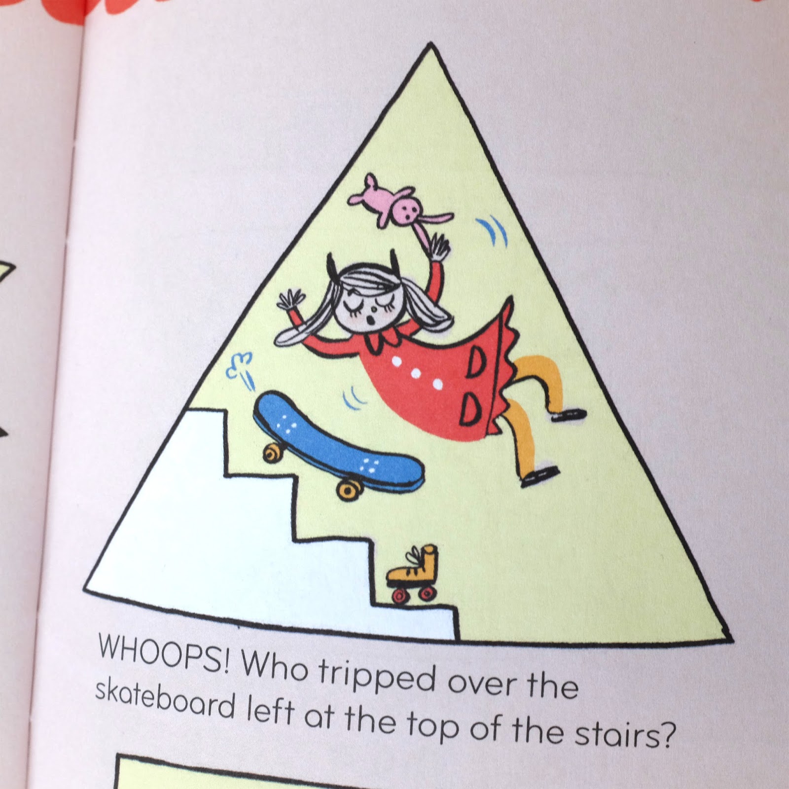
We discussed about how to create a double spread about health and safety. It would include electrocution, burning, flooding, getting cut with a knife, falling and more...Ouch! We talked about vintage health and safety posters, and the little rabbit that gets his hand stuck in the Parisian métro door. Now how to do this?
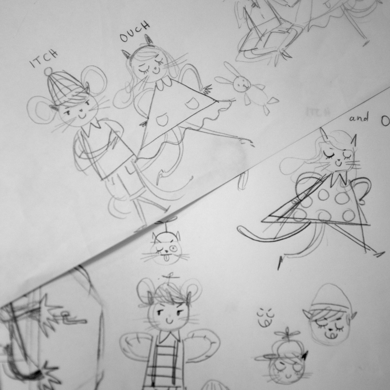
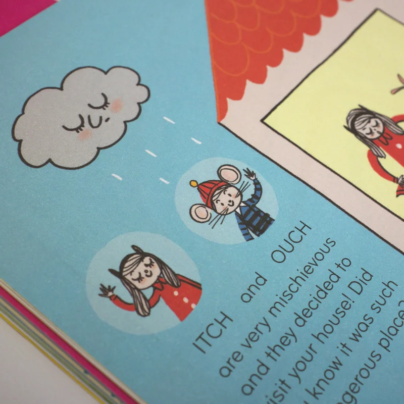
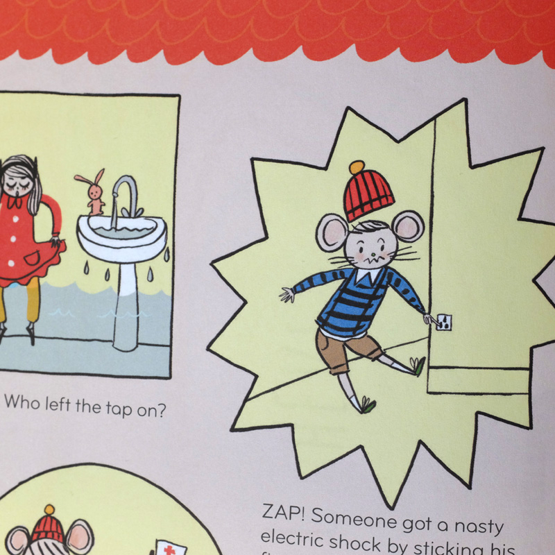
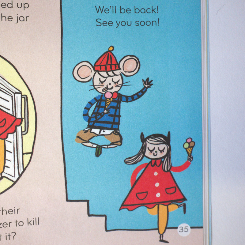
A clever way to narrate this would be by introducing characters that would string the accidents together. And from this brainstorm were born Itch and Ouch, a cheeky pair who get themselves into scrapes. Itch is a cat, Ouch is a mouse. It was interesting to experiment with ears and whiskers to help animate and vary their facial expressions. And who doesn't like anthropomorphic characters?
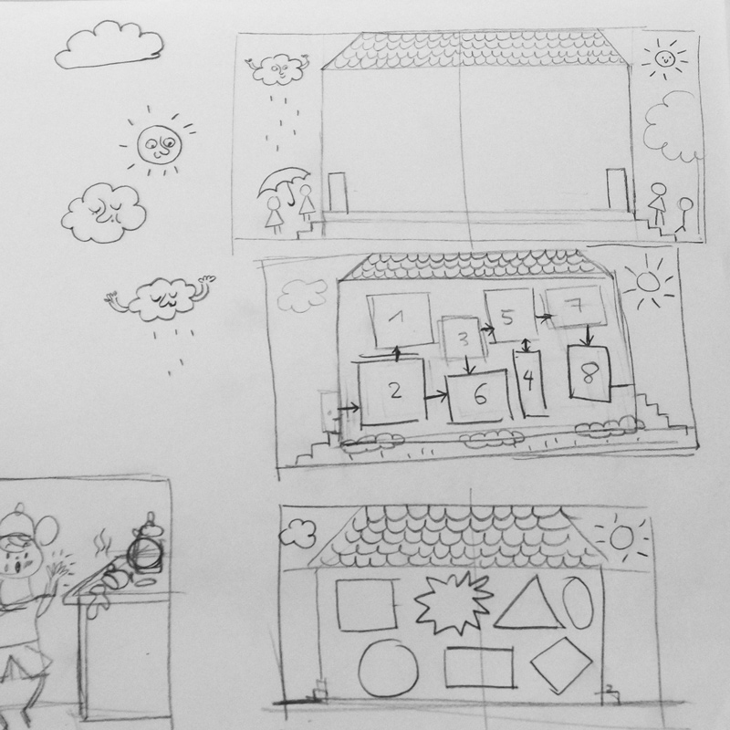
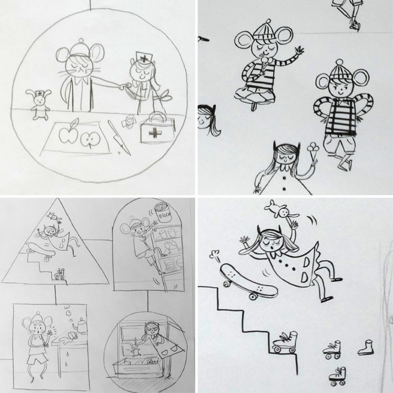
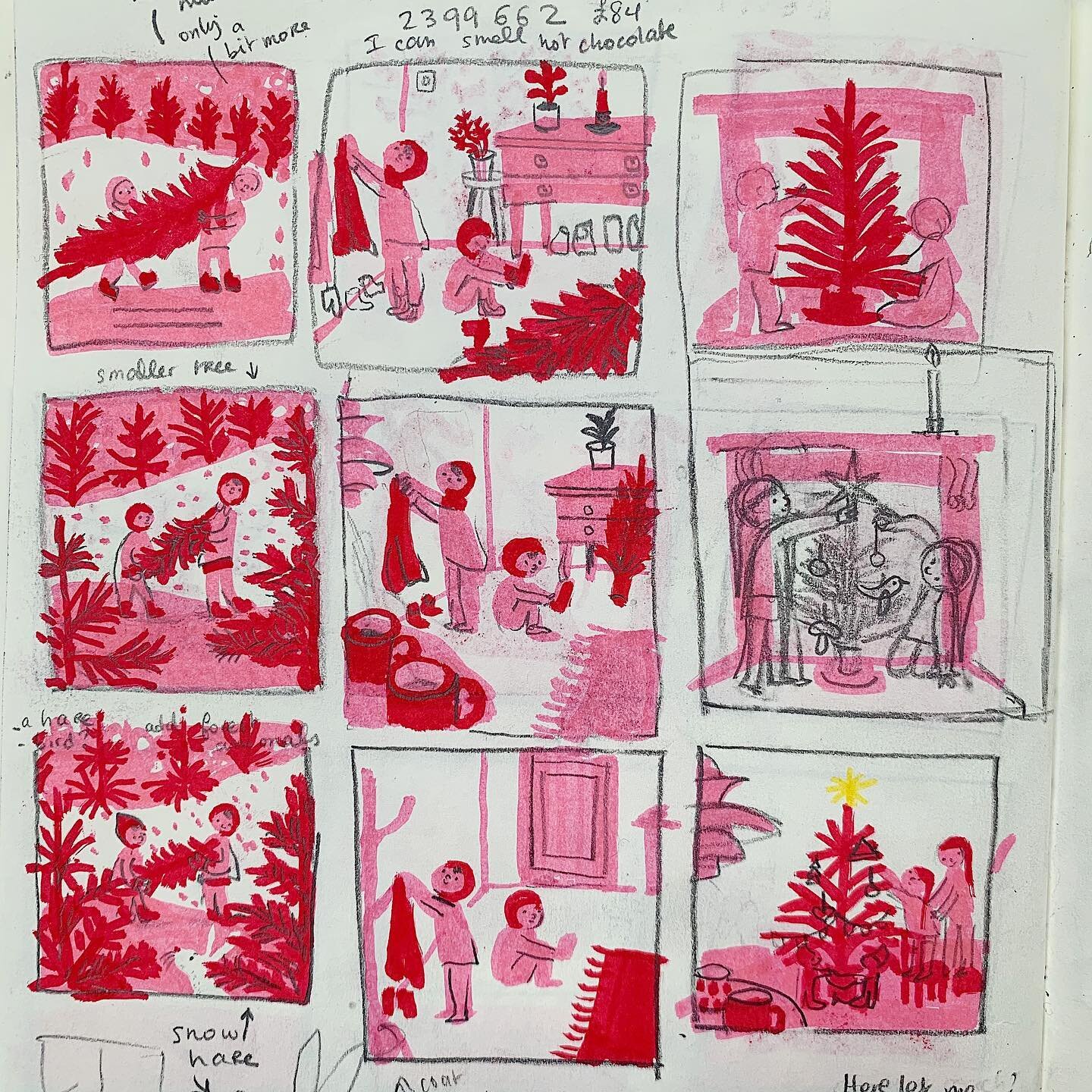
In terms of design layout, I isolated each disaster within a vignette to create a comics inside a house. It starts with rain and ends with a sunny sky. Like Hansel and Gretel, Itch and Ouch enter a house, full of DISASTERS! You can see this in the thumbnails below. I thought of the graphic shape of road signs and how the triangle symbolises danger, an explosive shape could signify fire or electricity etc. Working in matchbox sized thumbnails is my favourite method of speedily working out the composition.
As a little girl, I have happy memories of my mum buying me the French kids magazines Pomme d'Api and Astrapi. These were my very first comic mags. So it was like taking a trip down memory lane and being a kid again working with Okido. If you haven't read an Okido yet, the magazine is packed with stories, activities, games, doodles and even a recipe. I treated my 3 year old nephew to a subscription and he loves it! My illustrations are in issue 31 pages 34-35. Here's a link for Okido stockists.
