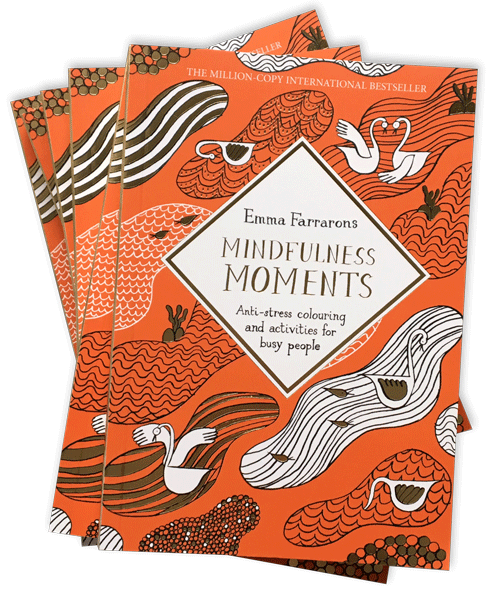
With a background as a picture book designer at the fabulous Macmillan Children's Books and a love for vintage packaging, it was especially exciting to illustrate and design the cover for the Mindfulness Moments colouring book. I thought it might be interesting to share with you the creative process that went behind designing this cover.
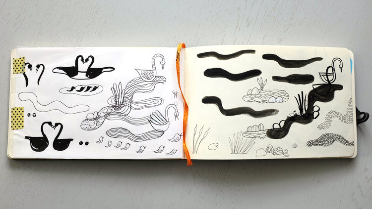
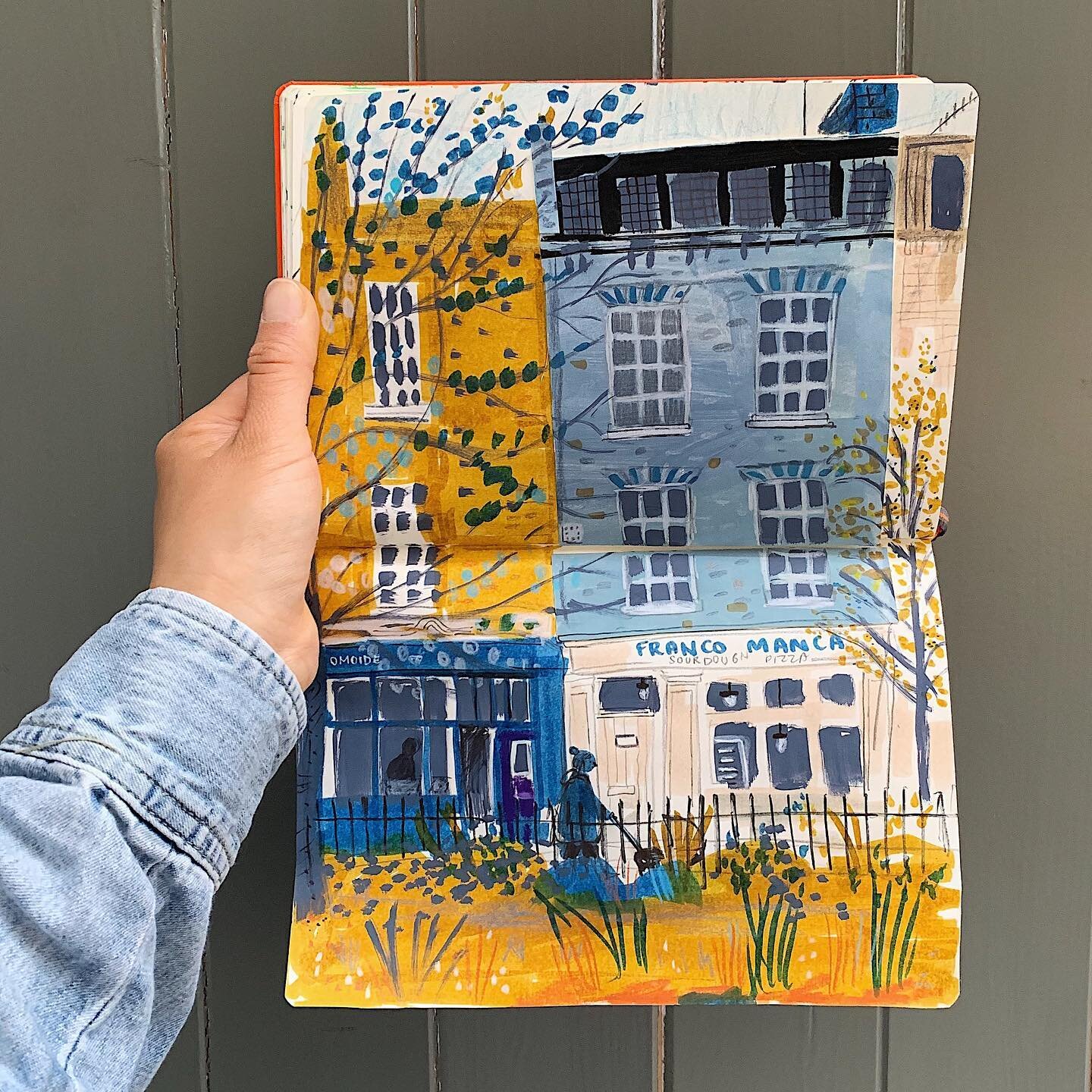
Step 1: To begin on any cover design, I fill my sketchbook with drawings. They are usually doodles of what I've seen out and about. In this instance, during my maternity leave, I did many mindful walks along the Serpentine lake, in Hyde Park, to watch the birds bathing in the water. There was wide array of fowl including moorhens, seagulls, geese, starlings and herons. But it was the graceful white swans that caught my eye. I liked how they twist their necks in all directions and unfold their wings like fans. I enjoyed watching them float solo or in pairs. A small sketchbook in the coat pocket was perfect to catch observational details like these.
I also studied the waves, ripples and how water shimmered in the Serpentine lake. For my pattern, could the water be wavy, straight or on a diagonal? Could there be puddles or 'clouds' of water? Could each puddle have a different texture such as beads on a necklace, squiggles, dots, waves, stripes, connected circles? Could the puddles be inhabited by dragonflies and reeds?
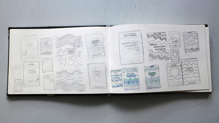
Step 2: Before working on the graphic side of a cover layout, I think it's essential to leave one's desk. I usually go to a favourite part of town and navigate my way between interior shops, chocolate boutiques, stationery shops, exhibitions, delis, etc. I like old school French packaging, labels on ink bottles, vintage stamps, whimsical Japanese packaging and clean cut Scandinavian graphics. I also enjoy looking at boutique hotel branding, the menus of cafés and restaurants or wine labels. There is inspiration everywhere. I keep an eye on shapes, signage, and finishes. Could the title be framed inside an oval, a circle or a square? What if I rotate the square into a diamond?
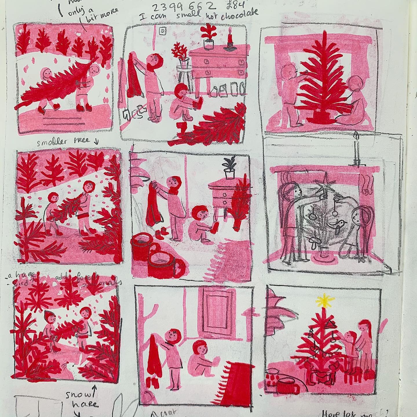
Step 3: Working in matchbox sized drawings is a quick an easy way to create numerous versions and variations of an idea. In book design, we call these thumbnails which I've always found funny because they are really the size of a teabag. I like to draw and to redraw these thumbnails over and over until there are a few ideas which stand out.
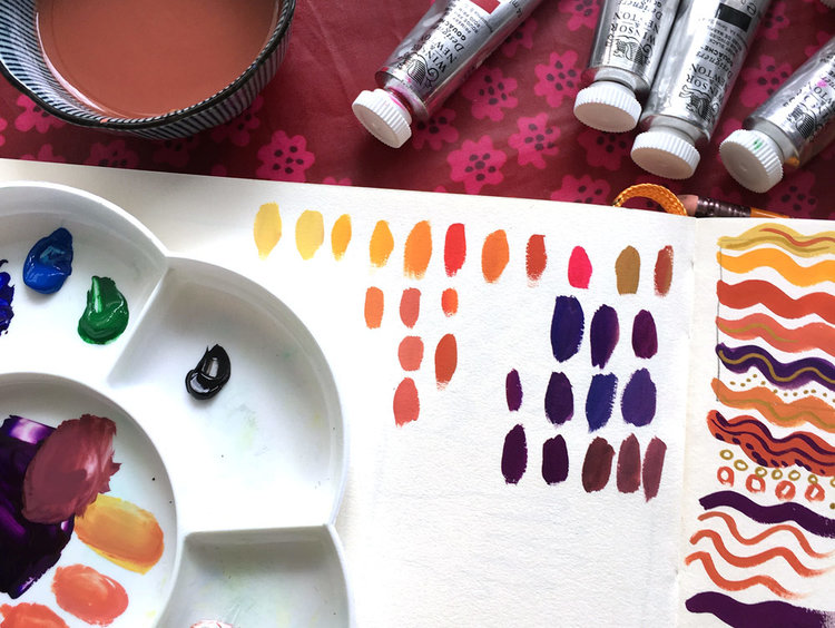
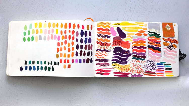
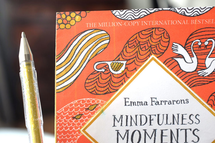
Quite early on, during thumbnail stage, I like to look at colour. Pantone books come in handy but gouache paint is my favourite tool for this, as the paint is rich in pigments and you can create your very own shade. Also, there is something mindful about mixing colours - especially with a palette knife. Add a speck of blue and your colour becomes a shade colder... just like that! I researched a colour which look particularly good next to gold foil. A rusty pumpkin felt just right. For a foil preview, gold glitter pens come in handy. They are a cheap and easy trick to have a closer idea of what your cover will look at the final stage.
Final step: Time to get some paper and calligraphy ink pens out and draw the final line art which I will later and assemble using Photoshop and Indesign.
I hope you enjoyed reading this creative process post. Mindfulness Moments was printed and bound in Italy in the Autumn. I'm happy to share with you that is now available in UK book shops and on Amazon. I made a video to give you a preview of the inside spreads of book which you can watch here. My US publisher, The Experiment, has published the American edition under a different title Moments of Mindfulness and different cover design. You can find it here.
